Work / Whitmore Estate Counsel
Whitmore Estate Counsel
How we sold a law firm on slowness—and reframed estate planning as a conversation, not a transaction.
Messaging · Design · SEO
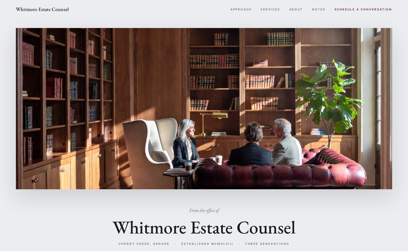
Compete on a deeper definition of the work.
Whitmore Estate Counsel is a third-generation estate-planning firm in Cherry Creek, Denver—founded in 1948 and led today by Margaret Whitmore, the founder’s granddaughter. As a concept project, we built the firm from the ground up: the heritage, the founder’s conviction, the positioning, and the site.
The strategic problem is that every estate attorney claims the same things—tax expertise, sound instruments, a smooth turnaround. The buyer is a family business owner with five to fifty million dollars in family wealth, in their sixties through eighties. They are not in a hurry, they have likely been failed by a firm before, and they prize discretion and continuity above almost everything. The brief was to compete on a deeper definition of the work itself—and never resort to the fear other firms reach for.
We reframed the problem instead of agitating it.
One idea shapes every word: estate planning that begins with what your wealth is for. Most buyers arrive believing they need a transaction—documents drafted, taxes minimized. We move them toward a different understanding: the real work is a conversation about what the wealth is for, and a technically perfect plan can still come apart in a family if that conversation never happens.
This buyer already knows they need a plan—but they are aware of the wrong problem. So we don’t agitate a pain they’re living, and we never frighten them. We re-orient, at a high altitude, with dignity. Even the pace is part of the message: the page is built to be read slowly, so the reader feels the same considered attention they’ll receive as a client.
A page built to be read slowly.
The design’s job was to make the firm feel inherited, not marketed—and to make slowness itself persuasive. The page reads more like the opening of a well-printed book than a website: long lines, generous white space, declarative statements where a marketing page would put a punchy hook.
A cool grey-blue ground with a single oxblood accent—nothing bright, nothing urgent. The warmth is held in reserve, used only where heritage needs signalling.
A single classical serif—EB Garamond—for both display and body, so the whole page reads as one continuous document rather than a layered marketing page. Inter is reserved for small UI labels alone.
The homepage those decisions produced.
Built end to end as a concept project—messaging, design, and SEO, on a real, responsive page.
Opens the Whitmore demo in a new tab.
Want this kind of thinking for your firm?
The Conversion Build is our full website package—copy, design, and SEO together, live in 30 days.