Work / Field & Frame
Field & Frame
How we proved a builder’s taste instead of claiming it—through specificity, and the projects they refuse to build.
Messaging · Design · SEO
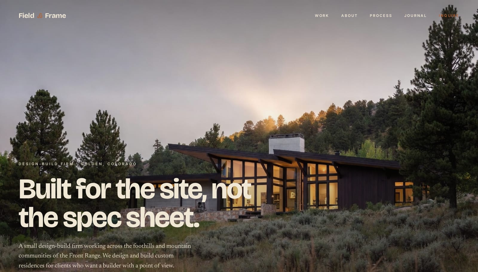
Prove a point of view, in a field of order-takers.
Field & Frame is a design-build firm in Golden, Colorado—founded in 2017 by Jake Caldwell, a builder first who learned design because the work demanded it. They build $1.5M–$10M custom homes across the Front Range and Colorado mountain communities. As a concept project, we built the firm from the ground up.
The buyer is building or renovating a $1.5M–$10M home—sophisticated, comparing options, and quietly terrified by the category’s reputation for cost overruns, endless timelines, and an architect and builder who blame each other. Every builder promises “premium finishes” and “your dream home,” so taste and judgment are invisible in the abstract. The brief was to prove a genuine point of view in a field of capable order-takers—without the empty luxury vocabulary everyone else uses.
Specificity, and refusal.
A point of view can’t be claimed, only demonstrated. Any builder can say they care about craft—the words are worthless. So the page doesn’t assert taste; it proves it, through two devices that run its whole length: specificity, and refusal. Specificity proves the firm knows the work—not “high-end materials,” but “stone base, board-formed concrete, walnut interior.”
The most persuasive content is what the firm won’t do. It won’t build a house that fights its landscape, won’t use materials that won’t last, won’t build over ten thousand square feet. Every “no” is proof of the “yes”—and for an anxious, sophisticated buyer, that refusal is the most reassuring thing on the page. It means the firm cares more about the work than the sale.
Built like an architecture feature.
The design feels like an editorial spread—premium photography, restrained typography, materials forward. The page looks like the company that builds it: made of real materials, opinionated about what good looks like. The palette is drawn from the materials themselves—stone, walnut, board-formed concrete, copper.
Stone tones for the ground, dark walnut for the ink, and an earthy copper-rust as the single accent—the color of weathered metal, never a marketing highlight.
Bricolage Grotesque at heavy weight for architectural headlines, Newsreader for editorial body prose, and Inter for UI labels. Three typefaces, three jobs, no overlap—the pairing is what gives the page its magazine-feature quality.
The homepage those decisions produced.
Built end to end as a concept project—messaging, design, and SEO, on a real, responsive page.
Opens the Field & Frame demo in a new tab.
Want this kind of thinking for your firm?
The Conversion Build is our full website package—copy, design, and SEO together, live in 30 days.