Work / Rose Maddox
Rose Maddox
How we won over a skeptical enterprise buyer with proof over inspiration—by naming their doubts before they could.
Messaging · Design · SEO
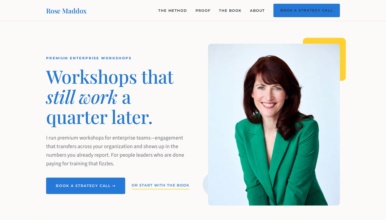
Convince a buyer who’s already been burned.
Rose Maddox is a personal brand, not a firm—an enterprise workshop expert and author of “Workshops that Work,” based in Denver. She spent twelve years as a corporate Head of Learning & Development before building her own method. As a concept project, we built the brand from the ground up around one fact: she was the buyer before she was the seller.
The buyer is an enterprise people leader—a CHRO, a VP of HR, a Head of L&D—sophisticated and burned. They’ve sat through the famous-vendor workshop that drew a standing ovation and changed nothing by the next quarter. They arrive skeptical, hunting for the holes, with a CFO scrutinizing every line. The brief was to convince a buyer who distrusts the entire category.
Name the doubt before they can.
A skeptic can’t be talked out of skepticism—only beaten to it. So the page never opens with enthusiasm, because that’s the exact language of the vendor who already failed them. Instead it raises the reader’s objections before they can, and answers each one with a number they already track.
The credential that makes it land: Rose was the buyer first. She can name the objection better than the reader can because she used to carry every one of them herself. And every claim resolves to a figure—347 workshops, a 27–34% lift in sixty days, a $2.2M contract won—because this buyer distrusts adjectives. A figure can’t be hyped; it can only be true or false, and they can test it against their own world.
Warm enough to trust, credible enough to buy.
The design carries two jobs at once: feel personal and warm enough that a buyer connects to a human, and credible and evidence-forward enough that a skeptical CHRO trusts the data. The reference point is amyporterfield.com—photo-rich, approachable, expert-led—but pulled toward the enterprise: cooler, more disciplined, more numbers.
A confident, trustworthy blue carries every headline; a warm off-white keeps it human; and a single yellow pop, used sparingly, is the brand’s smile against the blue.
A high-contrast display serif—Playfair Display—sets every headline and every number, in brand blue. A statistic set in Playfair reads as evidence, not marketing. Source Sans 3 carries the body; Montserrat handles uppercase UI labels alone.
The homepage those decisions produced.
Built end to end as a concept project—messaging, design, and SEO, on a real, responsive page.
Opens the Rose Maddox demo in a new tab.
Want this kind of thinking for your brand?
The Conversion Build is our full website package—copy, design, and SEO together, live in 30 days.